NyceMoves
NyceMoves is an exclusive space for athletes to showcase their talent and build community while gaining access to resources for mental health, finance, and more. I brought Senior Product Designer Sean Marcano onto this team to work alongside me and help establish a design framework and a collaborative team environment.
Albany, NY
2021
The Challenge
Athletes encounter a variety of obstacles ranging from mental health issues to financial literacy. NyceMoves aims to foster an environment that encourages community conversations and resources.
The Goal
NyceMoves is designed to offer a user-friendly platform, enhancing athletes’ career through video sharing and gamification of video resources and lessons.
Process
Research & Analysis: We engaged in user interviews and surveys to grasp the pain points and requirements of our target audience. Additionally, we analyzed trends within the fitness and social media sectors, and performed a thorough competitive analysis.
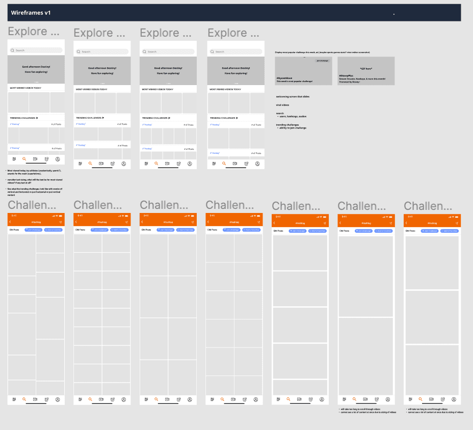
Wireframing & Prototyping: I began wireframing after having a discussion with the CEO and stakeholders and taking notes on what their ideas for the explore page of the app should look like. I then narrowed down my notes to what I believe is most beneficial for our end users and what would be necessary to keep them engaged and encourage them to explore the app. I wireframed a few different variations of what the explore page should look like (column count, content orientation, sizing, etc.) and after discussion with the team and my co-lead product designer, we decided that a three-column layout would fit best for the content type and scrolling behaviors that we naturally expect from our users.
Design Choices: After discussing with the CEO and stakeholders and jotting down their ideas for the app's explore page, I narrowed down the most beneficial elements for our users. I then created wireframes of various explore page designs, considering factors like column count and content orientation. After team discussion and collaboration with my co-lead product designer, we settled on a three-column layout, aligning with our users' expected scrolling behaviors and content type.
Visual Design & Style Guide: We established a unified visual identity, encompassing color schemes, typography, and iconography to maintain consistency across the app. Additionally, we crafted a style guide to uphold this design coherence in forthcoming updates.
Conclusion
Although NyceMoves didn't go live, it was an enjoyable design endeavor. I designed a platform that not only enhances the learning process for users but also instills a sense of accomplishment and motivation. This, in turn, boosts user engagement and retention, empowering athletes in a multitude of ways.


